Identity
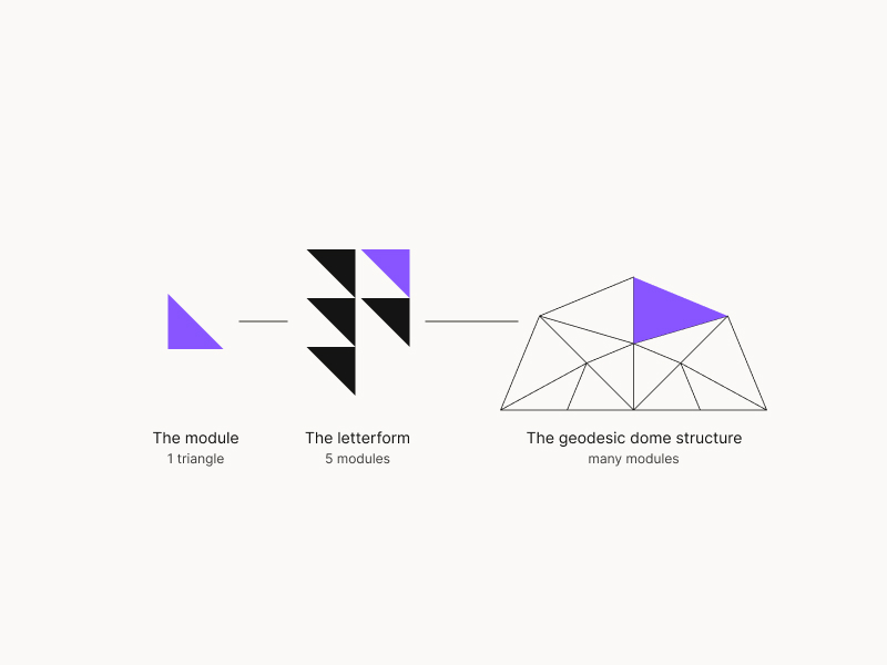
How the Fortiv mark was built — from a single triangle to a resilience structure.

The Module
Everything starts with a single triangle — the smallest indivisible unit of the identity. It represents one element of preparedness, one facet of a plan, one node in a network of resilience.
The Letterform
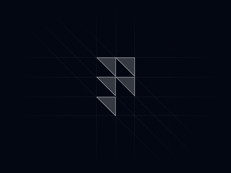
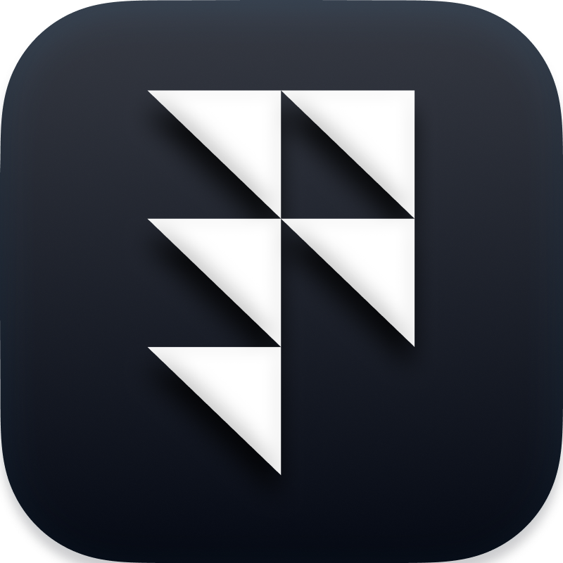
Five modules compose the F mark — a geometric letterform built on a precise grid. The negative space creates forward momentum; the stacked triangles echo layers of a structured plan.

The Geodesic Dome
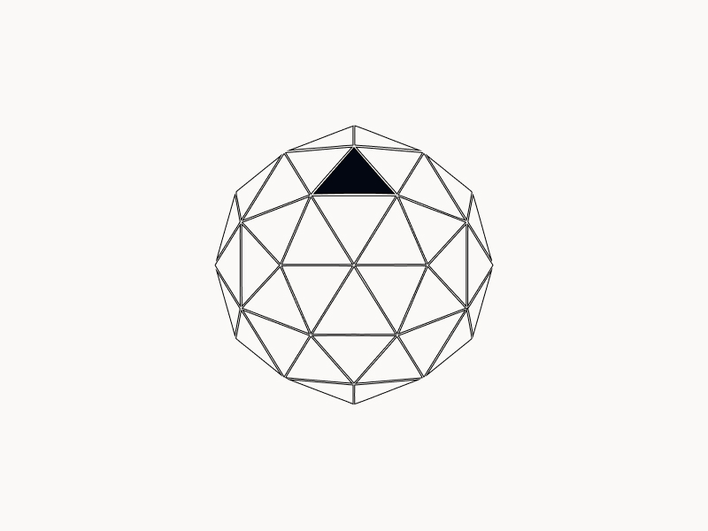
Scale the module infinitely and it forms a geodesic dome — a structure where every triangle shares load with its neighbours. It’s the perfect metaphor for resilience: remove any single piece and the whole still stands.
The Wordmark
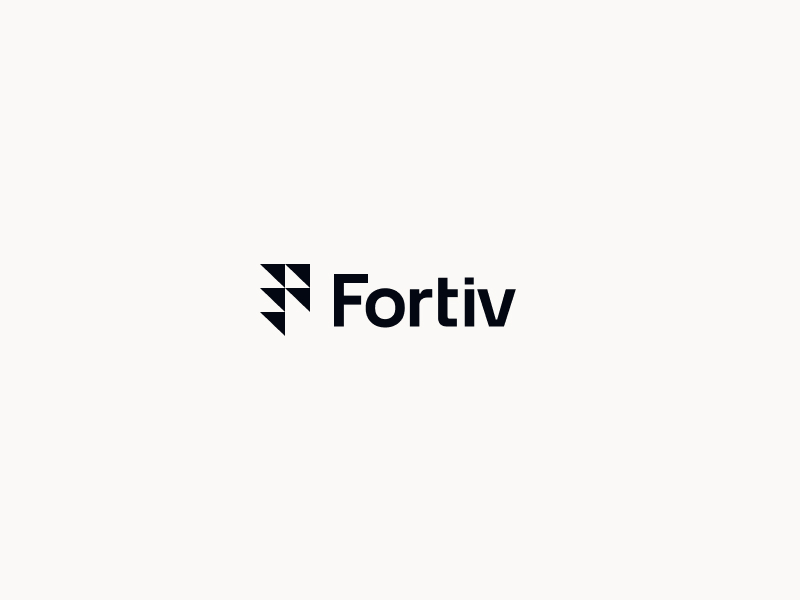
Mark meets type. The wordmark pairs the geometric F with Space Grotesk — grounded, modern, engineered.
 On light
 On dark
The App Icon
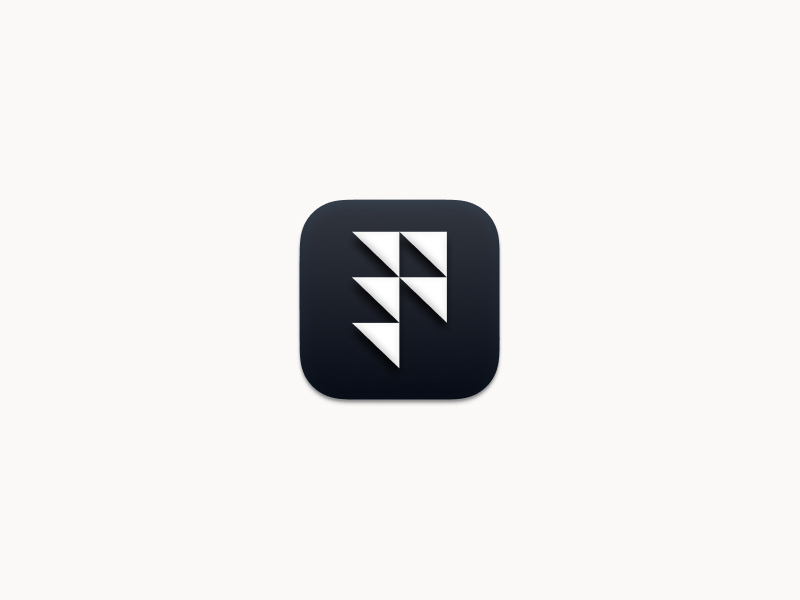
The mark lives in a rounded container for app stores, favicons, and system trays. The dark surface gives it depth and presence at any size.
In the World
The mark is designed to work at every scale — from a 16px favicon to embroidered apparel. It stays legible, distinctive, and unmistakably Fortiv.